- nl
- en
- fr
Strengths of Power BI: time-bound calculations and insightful visualizations
Business intelligence
Time intelligence
Visualizations
Insights

In a previous article, the differences between Excel and Power BI were explained. Now you know that Power BI is a forward-looking tool, where can we find the strengths of Power BI for your reporting needs?
The added value of Power BI lies in the time-bound calculations, as well as in the compelling visualizations.
These two tools ensure that you don't get bogged down in data, but instead, immediately, see the causes of an increase or decrease in your numbers.
Power BI allows you to respond directly to changes in your data and communicate them throughout your organization.
Know how your organization is evolving with the help of time-bound calculations.
Power BI has numerous time-bound calculations or time intelligence functions. With these functions, you can calculate your revenue once for month to date (MTD), quarter to date (QTD), year to date (YTD) or fiscal year to date (FYTD). Each time you open your Power BI report, the calculations are refreshed, giving you a real-time view on the actual numbers up to now. Additionally, you are able to compare your revenue for MTD, QTD, YTD, FYTD to last year’s figures, giving you a quick snapshot of how your numbers are evolving. Is your organization performing better or worse than last year?
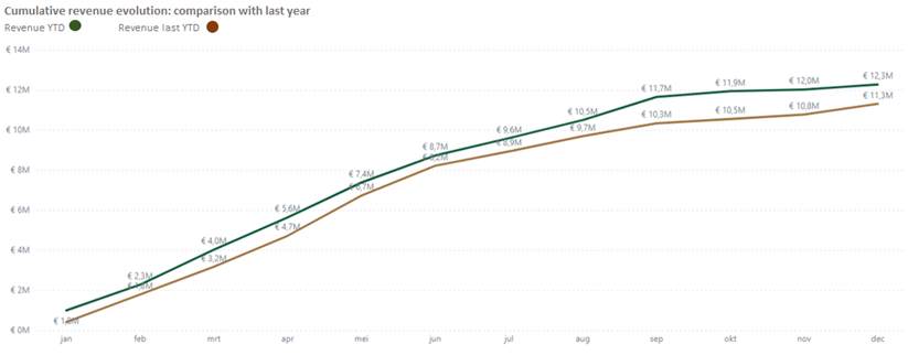
In the line chart above, you can see the cumulative revenue evolution of this year, compared to last year. It is a quick way to see the progress your organization made.
Stay on top of your organization with useful visualizations.
Power BI has an extensive range of visualizations, or shortly "visuals". With compelling graphs, you can quickly gain insight into your numbers.
Below, we show which visual will give you a quick answer to some frequently asked business questions.
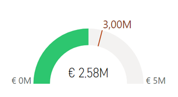
- Are you achieving your revenue target this year?
Instead of manually calculating the sum, Power BI visually shows that your business has some catching up to do. The target for revenue has not yet been achieved.
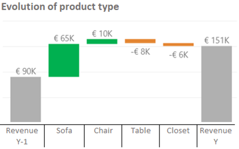
- How is your sales performance evolving across different product types compared to last year? Assume you're selling chairs, sofas, tables and closets.
Using a waterfall visualization, we show that the sales of chairs and sofas have increased, while tables and cabinets did slightly decrease. You get this insight quickly and easily, without having to think about calculations.
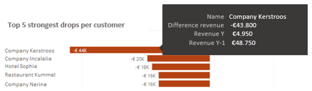
- Which customers bought less from your organization last quarter? Assume your customers are restaurants, hotels or businesses.
Based on a simple comparison formula and graph, we can see an overview. For example, company Kerstroos bought €43.800 less than last year. In this way it is possible to give this information to the appropriate representative, so that they can contact the customer.
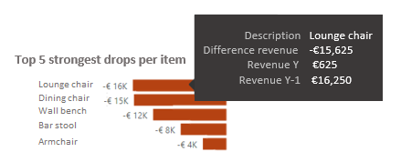
- Which items were barely sold compared to last year?
At a glance, you can see that lounge chairs generated less sales in comparison with last year.
The examples above only show a limited selection of your reporting options, but they do illustrate that Power BI makes it possible to understand your figures easy and fast. This way you always focus on the why of your figures. You do not focus on one revenue figure, but see connections so that you can respond in a timely and targeted manner.
Convinced of the power of Power BI? Would you like to replace the typical, extensive Excel documents in your organization with clear Power BI reports that support both you and your colleagues in daily operations? Contact us for more information.
Justine Rousseeuw - 7 februari 2023